Purpose
The 2023 Spring Sing show needed a unique and distinctly different design from previous shows and aligned with the theme April Fools.
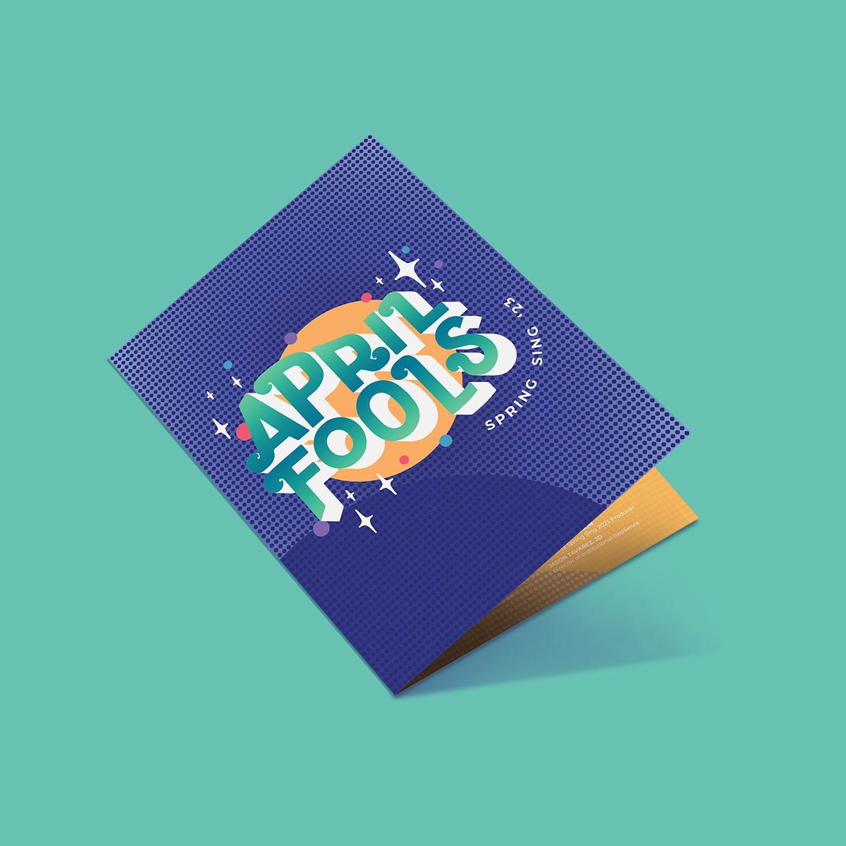
Spring Sing is an annual Westmont College tradition where all 7 dorms put together their own skits to win the best performance. The show has also become a part of Santa Barbara’s tradition as it is hosted in the city’s largest amphitheater, the Santa Barbara Bowl.
The 2023 Spring Sing show needed a unique and distinctly different design from previous shows and aligned with the theme April Fools.


April Fools is a day meant for jokes and laughs. The logo was designed to reflect the fun connotation of this theme. I utilized vibrant colors and soft shapes for an approachable appearance.
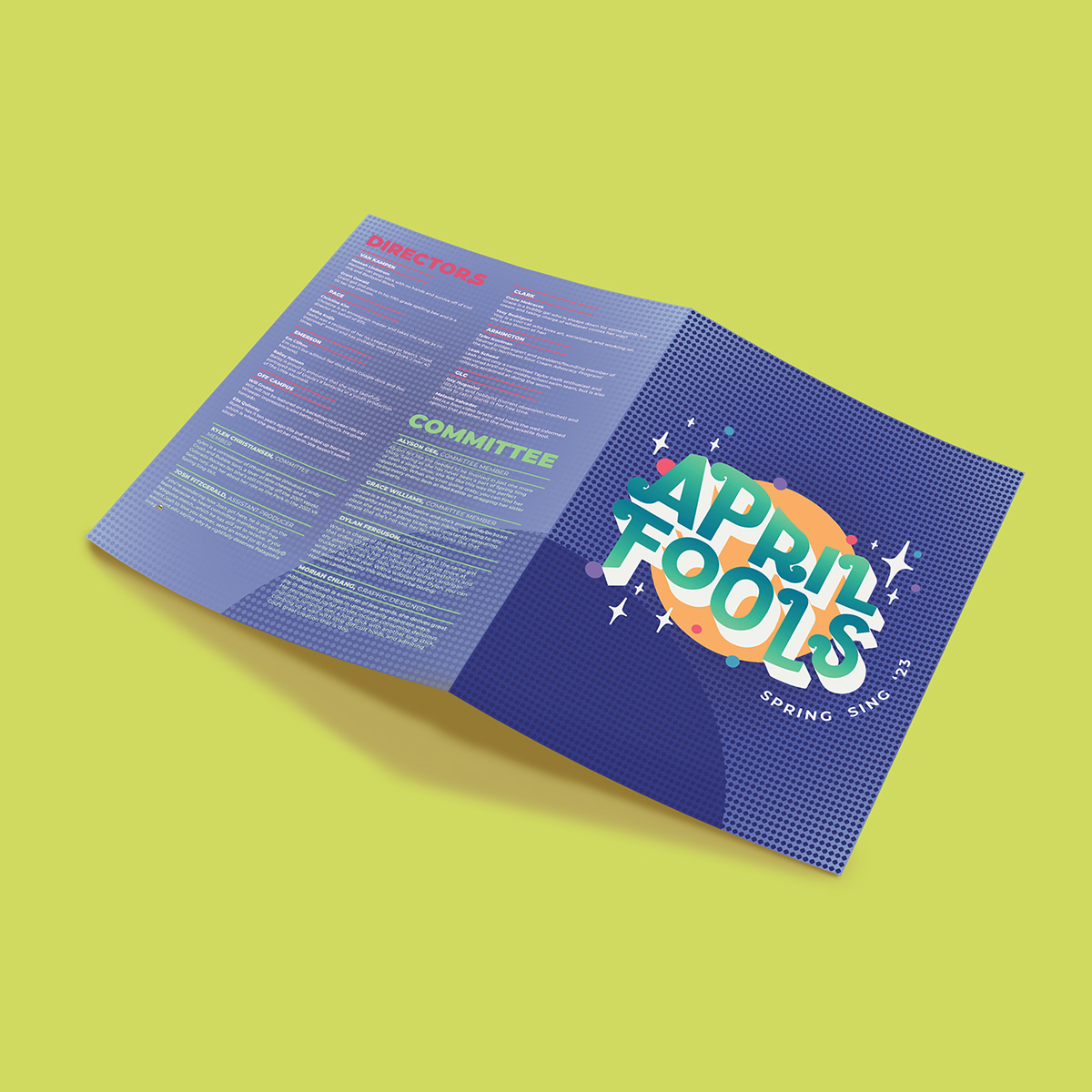
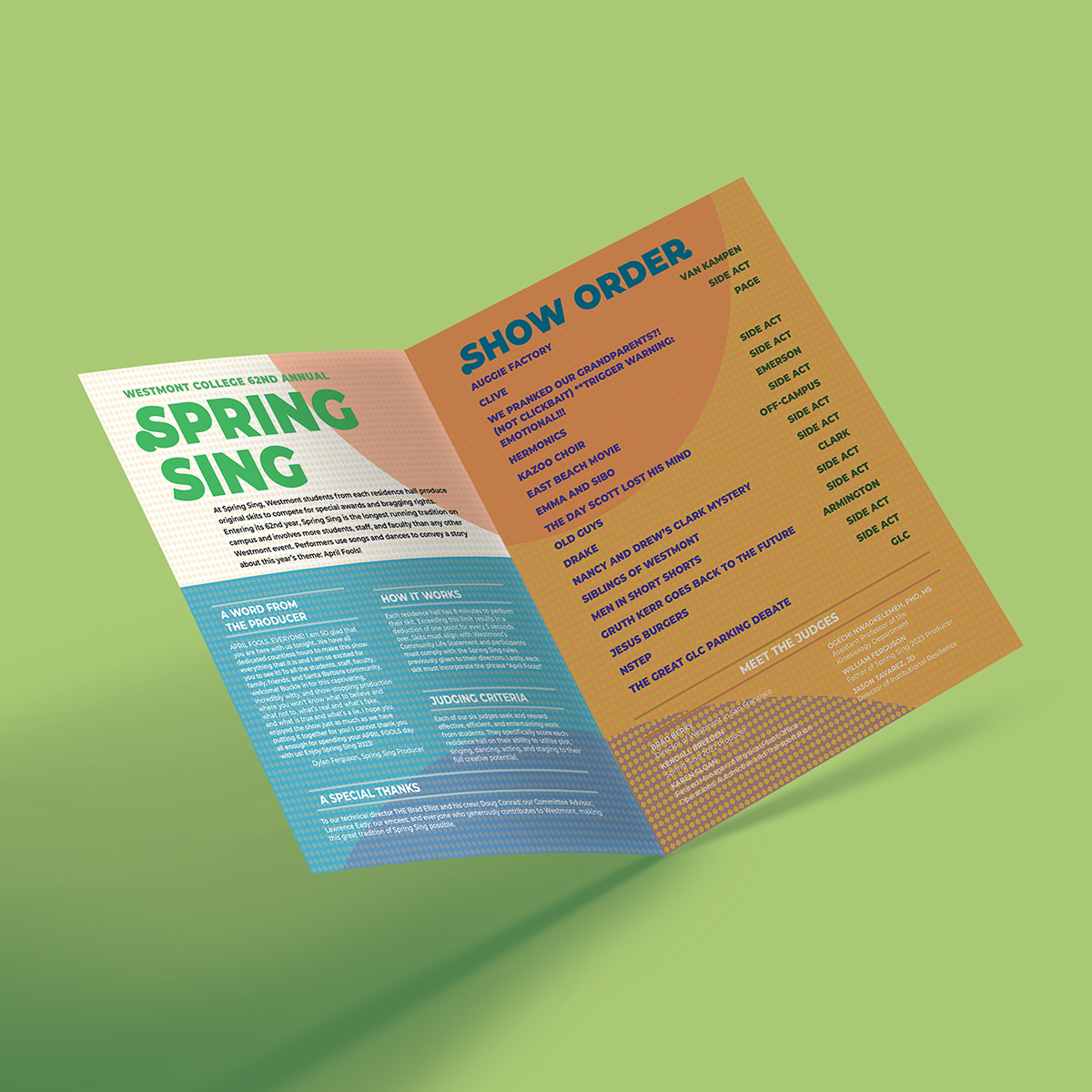
I liked the use of the vibrant colored balls in the logo and continued using them in the show programs. The programs were made to summarize the show, provide a printed schedule, and highlight everyone who was involved in the show.
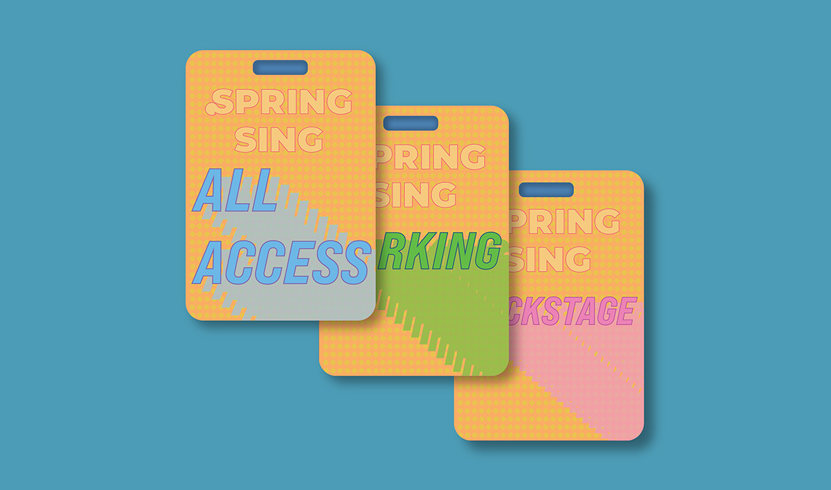
Anyone helping with the show needed a badge that let security know they are allowed backstage. This meant the badges had to be easily recognizable as related to the show. Similar to in the show program, colored balls were used again. I created badges for all access, reserved parking, and backstage access.
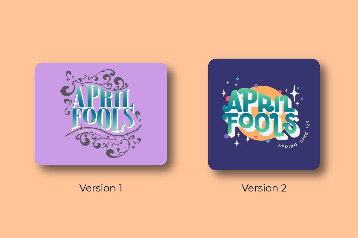
The first version of the theme design was taken in an incorrect direction. My first version of the logo, I wanted to play with an art nouveau style. I added flourishes and serifs giving the design a more graceful type of fun appearance. However, this design felt too outdated and neat for this type of event. Still inspired by designs of the past, I shifted to revamping the logo in a retro style. The design aligned better with the times and reflected the excitement of the show. Working with mistakes made the process longer but led me to a better product overall.
After seeing the 3 previous years of Spring Sing's theme design, I was excited to make my own identifiable face for the show. The vibrant colors and the fun shapes match the energy and excitement of the show. However, these elements also make the design look kind of common. If I were to redo this design, I would incorporate the vibrant colors in more organic forms. This way the design would have a more unique and specific shape that other designs don't have. The design I created still makes me proud and I like the overall visual identity.