Back to Projects

Koi: Health App

Koi Case Study

Koi is made to help the user complete goals and build habits for a healthier life. This was also an app designed through the Career Foundry's product design course. In this project, I created a fully prototyped app that includes 6 main features that help the user cultivate a healthy lifestyle.

My Process

congratulations

Problem & Hypothesis

The user is not sure how to begin their health journey but knows they want to live a healthier lifestyle. Koi eliminates the growing pains of starting with guided goal plans and a focus on growth.

  • I believe that by creating well defined goals with small tasks, the user will be more likely to accomplish the goal and build a habit.
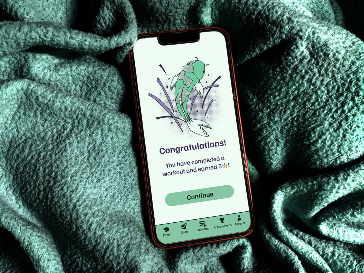
  • I believe that having in app motivation that is linked to the tasks that can be completed will encourage the user to work on their goals.
User personas

User Persona

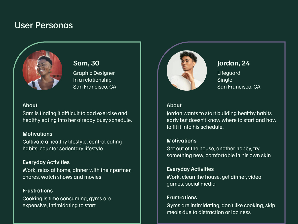
Meet Sam and Jordan. They are the types of users that I designed Koi for. They are both rather young individuals and have a willingness to keep up their health as they get older. They are both very familiar with technology and would have no trouble learning how to use Koi. Sam is interested in curating healthier habits into their life. Jordan wants working out to become one of his hobbies that helps him build his confidence and his muscles.

User flow

User Flow

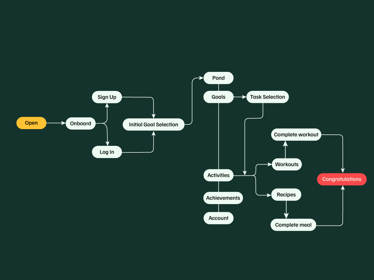
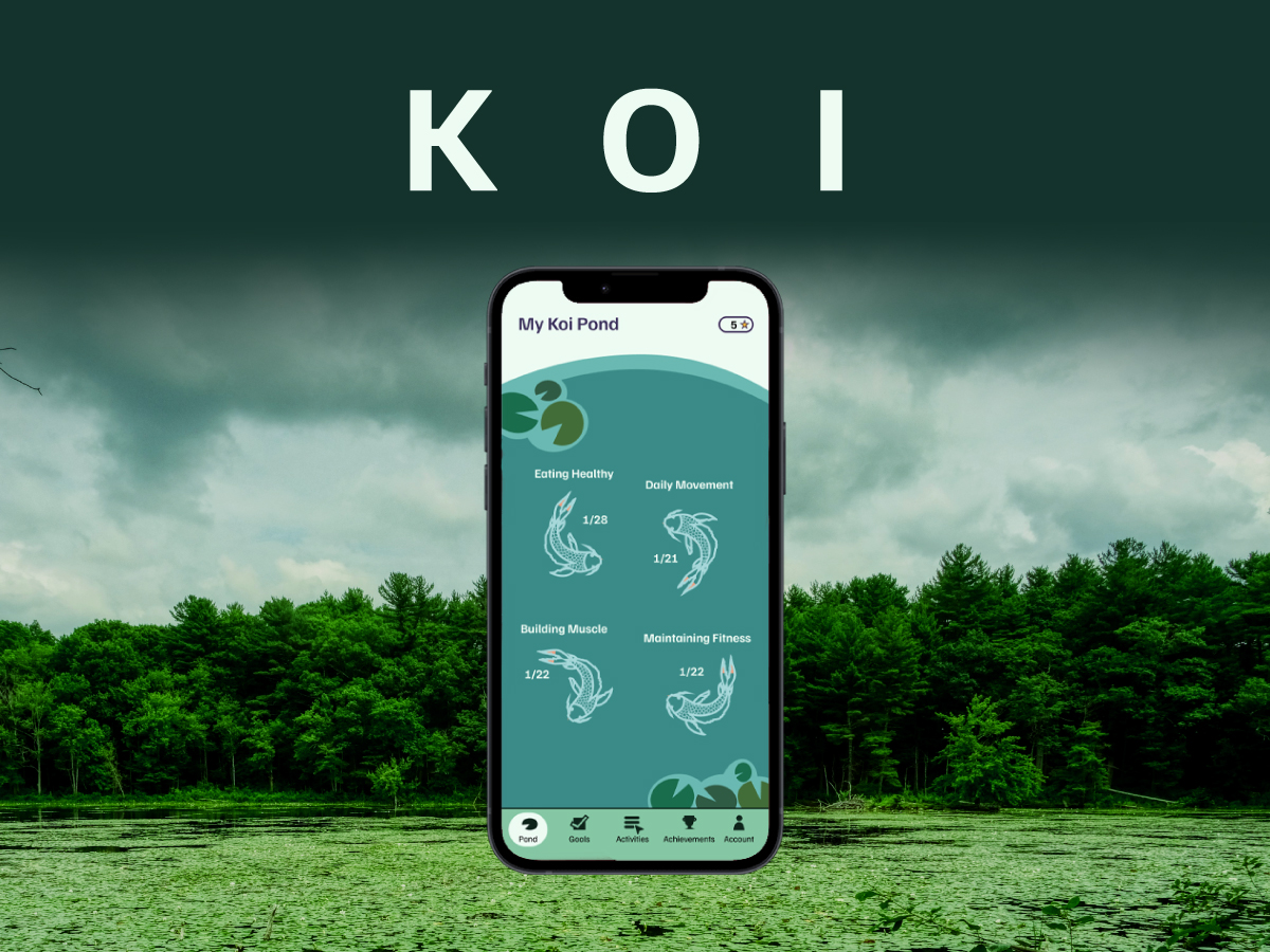
The user flow is made to guide the user through preprogrammed steps towards their goals. Once the user signs in, they are brought to the pond, which acts as a dashboard, where they can see the goals they are working on. Then the user can choose the activity they want to do to complete the task.

Wireframes

Wireframes

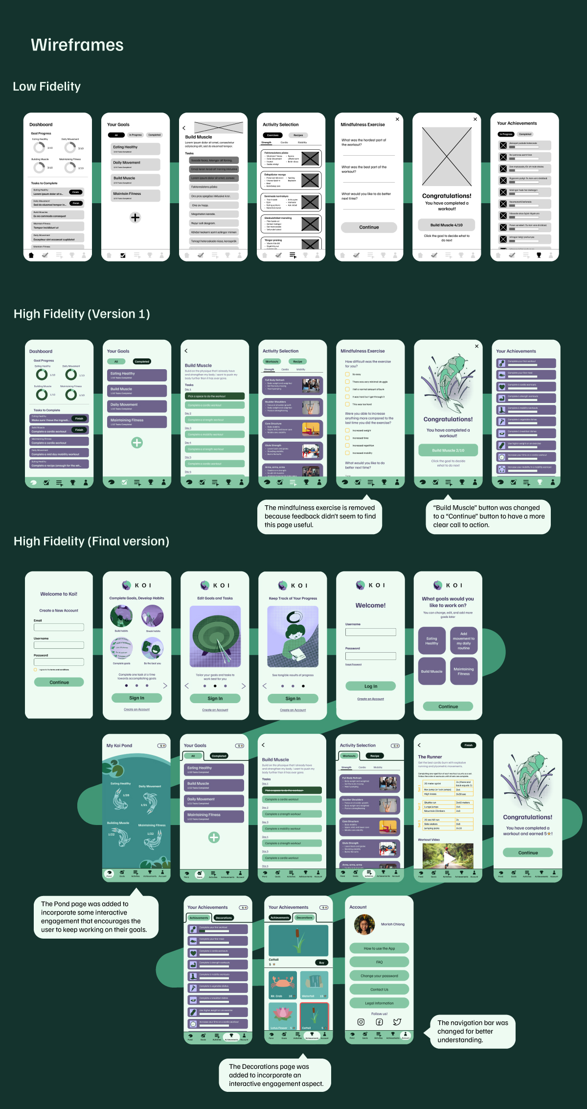
The low fidelity wireframes outlined the basic structure of the app. After revisions, I designed the first version of a high fidelity wireframe. This was the version I conducted usability tests on. Adjustment based on the usability tests, peer review feedback, and mentor feedback led me to the final version of Koi.

Challenges

Design System

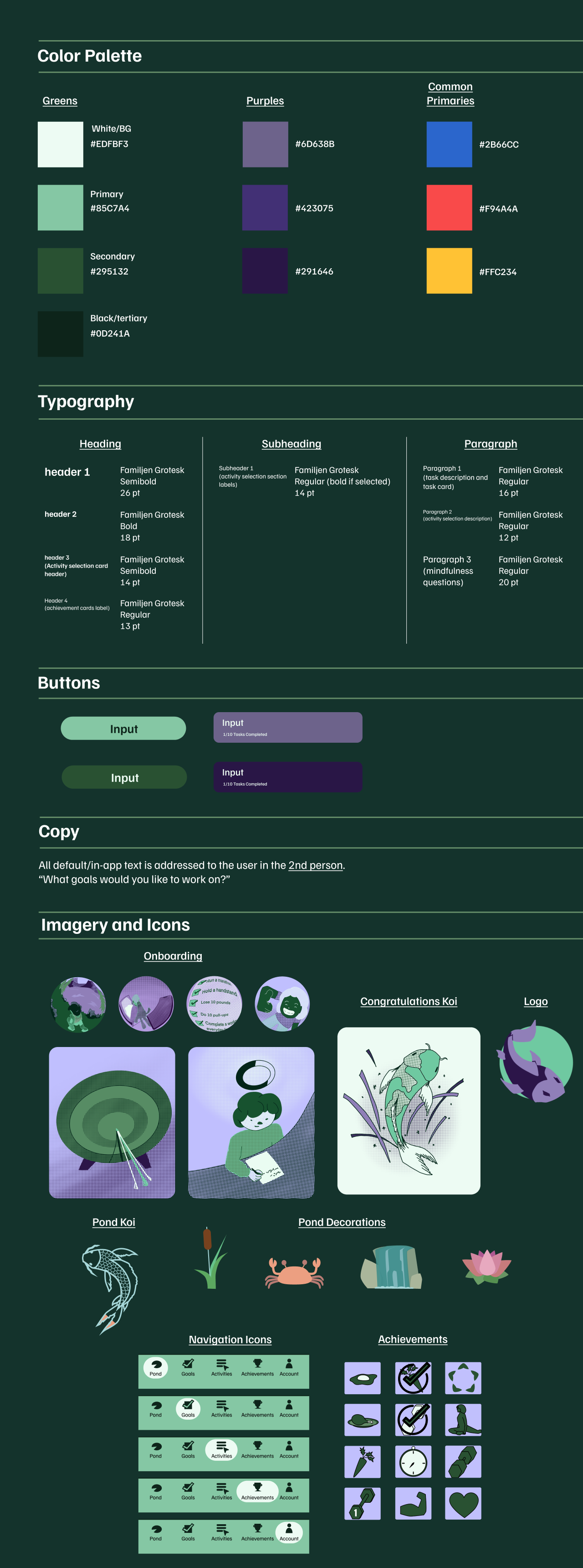
This design system was created to accentuate Koi's user-friendly interface that would make it easy for anyone to start using.

Challenges

Challenges

The biggest challenge was deciding on a clear direction for Koi. I knew I wanted Koi to be a typical health tracking app, while also include goal tracking capabilities, and involve a gamified component. Inspiration came from multiple apps and I did not know how to distill them.

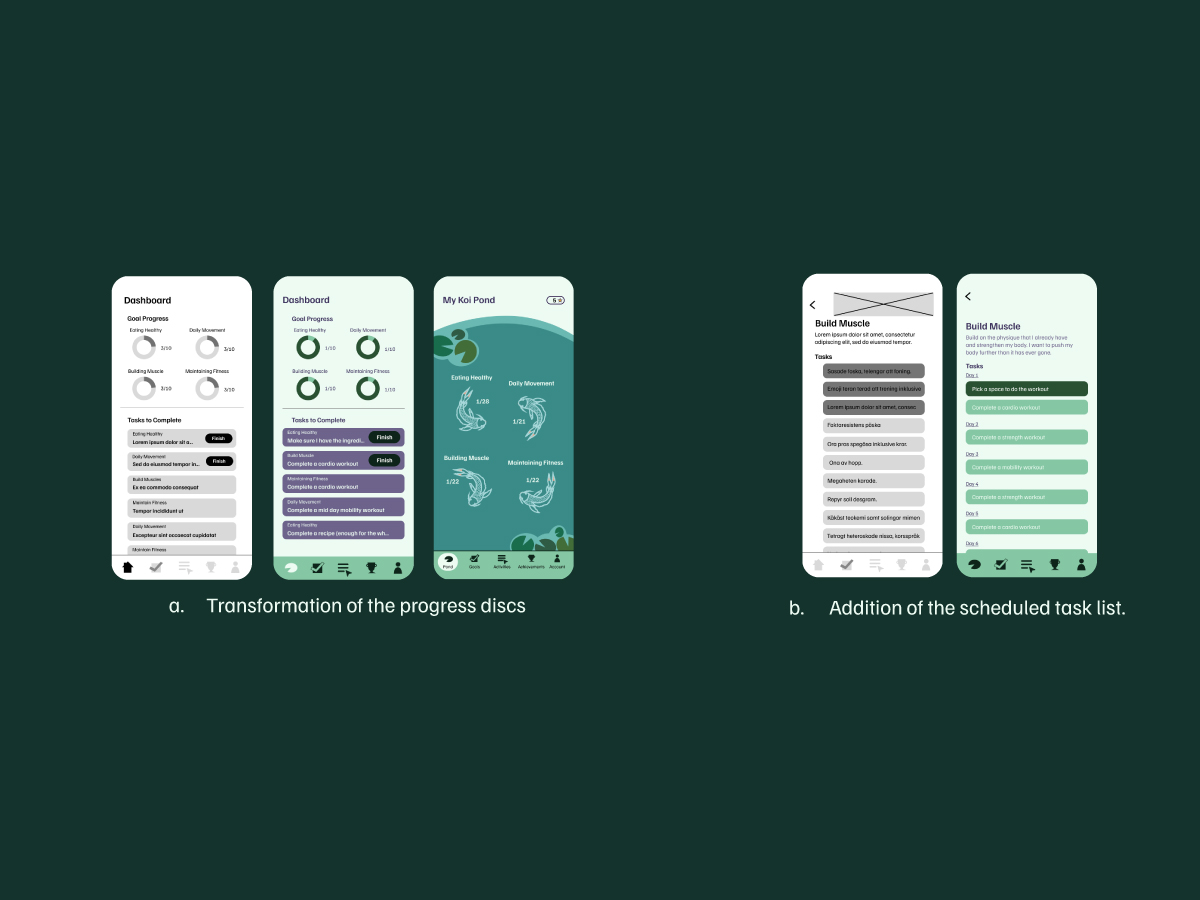
As I started making iterations, I decided aspects that I wanted to keep and remove. The progress tracking discs on the dashboard in the low fidelity and version 1 high fidelity prototype was very insightful. So when I redesigned the dashboard to incorporate a gamified feature, the discs stuck around (a). The tasks page in the low fidelity prototype began as a long list of things to get done, however in the version 1 high fidelity prototype, I made the list into a schedule for a more guided experience (b).

The system of operations I followed for this project was a bit different than the steps I normally follow. Many big decisions were made at the beginning of the process rather than at the last moment, like I am used to. Through this, I learned that the initial decisions are not hard rules just because I chose them initially. They are away to start the design process.
Conclusion

Koi has developed into a unique app that I'm very proud of. An abundance of inspiration provided so many options for Koi to become the app that I envisioned. The most difficult part of the process was conducting the user research as I did not have a good sense of what information was helpful for a design. Using Figma was also a difficult part, as I only knew how to use the software in very basic and tedious ways. I gained a lot of experience through this project. Koi is a presentation of the many hard earned lessons I accumulated throughout this project.